
Creating high-quality signage is not merely about having a good design, it also requires attention to numerous details. If any aspect is overlooked—such as stroke width or material thickness—the design may become impractical to manufacture and ultimately cannot be produced as intended.
What Is the Minimum Stroke Width?
The strokes of sign letters can vary in width. So, how thin can they be?
The minimum stroke width varies depending on the type of sign letter. Mirror-finish letters generally require a minimum stroke width of 6 mm. Acrylic faux neon signs generally require a stroke width of 15–20 mm. Non-illuminated welded metal letters can typically be fabricated with stroke widths of 5 mm or more. Back-lit letters generally require a minimum stroke width of 8 mm.
Mirror-finish Letters
Mirror lettering, in the signage industry, generally refers to three-dimensional letters or logos made of mirror-finished metal or acrylic with highly polished surfaces. Its front surface has a highly reflective, glossy finish, allowing it to clearly reflect its surroundings. It is usually made of stainless steel mirror panels, electroplated metal sheets, or mirror-finished acrylic, and is fabricated through processes such as laser cutting, welding, grinding, and polishing. In some cases, a backlighting structure is incorporated, giving it both a mirror-like appearance and a lighting effect. Such letters are commonly used by high-end brands, hotels, and commercial spaces to emphasize quality, elegance, and a premium appearance.
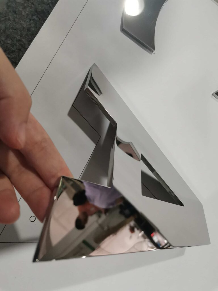
The stroke width of mirror-finish letters should generally be at least 6 mm. If the strokes are any thinner, high-precision processes such as wire-cut electrical discharge machining (WEDM) must be used. Although WEDM offers excellent precision, it is much slower than conventional fabrication methods, and production costs increase significantly.
Acrylic Faux Neon Signs
Acrylic faux neon signage is a type of illuminated lettering that mimics the appearance of traditional neon lights. It resembles conventional neon tubing but typically uses safer and more durable LEDs and acrylic structures to create a similar lighting effect, as shown in the video below:
The strokes of acrylic faux neon signs can be as narrow as about 5 mm, but a width of 15–20 mm is generally recommended. If the strokes are too thin, they may become structurally weak or even break. If they are too thick, they lose the appearance of traditional neon tubing.
Non-illuminated Welded Metal Letters
Non-illuminated welded metal letters refer to metal letters fabricated from metal sheets (commonly stainless steel, steel, or aluminum). They are produced as three-dimensional letters or logos through cutting, bending, and welding. Their structure typically consists of the face, returns, and back panel, all of which are securely joined by welding. Unlike illuminated letters, they do not contain an internal light source and therefore do not emit light. This type of lettering emphasizes metallic texture and a three-dimensional appearance while achieving structural strength through welding. They are commonly used for outdoor signage and interior feature walls where durability is important but illumination is not required.
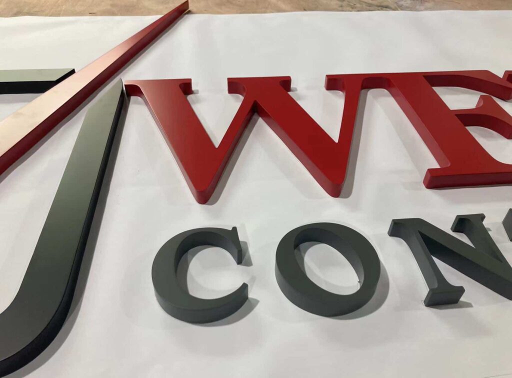
Non-illuminated welded metal letters can generally be fabricated with a minimum stroke width of 5 mm.
Back-lit Letters
Back-lit letters, also known as halo-lit letters, are channel letters designed so that light is projected toward the back, creating a halo effect around the letters. The light is visible only around the edges, as shown in the video below:
The strokes of back-lit letters typically require a minimum width of approximately 8 mm to provide enough internal space for LED modules or strips, as well as sufficient room for heat dissipation and maintenance.
Suggestions for Stroke Design
In general, it is recommended to keep stroke widths as consistent as possible throughout the design, rather than making some areas thick and others thin. Extremely thin strokes are more susceptible to structural weakness and may even break during fabrication or use. As shown in the diagram below, the design on the left is appropriate, while the one on the right contains excessively thin sections that may cause manufacturing problems:

What Is the Minimum Thickness?
Mirror-finish Letters
If the material thickness of mirror-finish letters is around 2–3 mm, the edges generally require little or no additional grinding.
When the material thickness increases to 5–6 mm, the edges usually need to be ground and polished, resulting in higher production costs.
Etched Plaques
The typical etching depth for metal etched plaques is between 0.2 and 0.3 mm, creating recessed text or graphics. The base metal plate is typically much thicker, usually around 1–2 mm.
Relief Plaques
In contrast, the relief height of an embossed plaque is typically around 1.5 mm, giving the plaque greater visual depth and a stronger tactile presence.
Acrylic Faux Neon Signs
The exposed acrylic thickness of acrylic faux neon signs is typically 10–15 mm to balance lighting performance, structural strength, and visual proportions similar to traditional neon tubes.
Back-lit Letters
Back-lit letters commonly come in two structural configurations:
- One uses a 5 mm thick polycarbonate (PC) back panel that sits flush against the wall while maintaining sufficient spacing for light diffusion.
- The other uses a 20 mm thick acrylic back panel (with approximately 10 mm exposed on the outside and about 5 mm inside acting as a light-diffusing layer). This allows the acrylic diffuser to remain visible from the side, producing a softer halo effect.
Key Takeaways
- Stroke width is not just a visual choice—it directly determines whether a design can be fabricated safely and cost-effectively. For most metal and acrylic letter types, anything below about 5–8 mm quickly becomes difficult or risky to manufacture.
- Material thickness and relief depth affect both durability and the perceived quality of a sign. Thin metal faces, shallow etching, or undersized acrylic may look acceptable on screen but can fail either structurally or aesthetically in real-world applications.
- Different sign types have different engineering limitations. Mirror-finish letters, acrylic faux neon signs, non-illuminated welded metal letters, back-lit letters, etched plaques, and relief plaques all have their own minimum stroke widths and thickness requirements. These values should be treated as design constraints rather than optional preferences.
- Keeping stroke widths consistent throughout a design and avoiding excessively thin sections helps reduce weak points, prevent breakage, and improve manufacturability. Good signage design always balances aesthetics with practical fabrication requirements.
If you’re unsure whether your signage design meets these minimum stroke width and thickness requirements, feel free to contact us at FT Signage. We’re happy to review your artwork and provide practical recommendations before production begins.