Although Europe has many countries, the European Union has been committed to standardization in various aspects. For example, it established the Schengen Area for border checks, the Euro monetary system for finance, and the unified standard EN 17210 for accessibility. All of these have made Europe more convenient in all aspects.
This article will mainly discuss the installation of European Braille signs from the aspects of content, visual contrast, and installation height.
Tactile Braille Sign Content
Whether the installation of Braille signs is compliant depends first and foremost on whether the content on the signs meets the standard requirements.
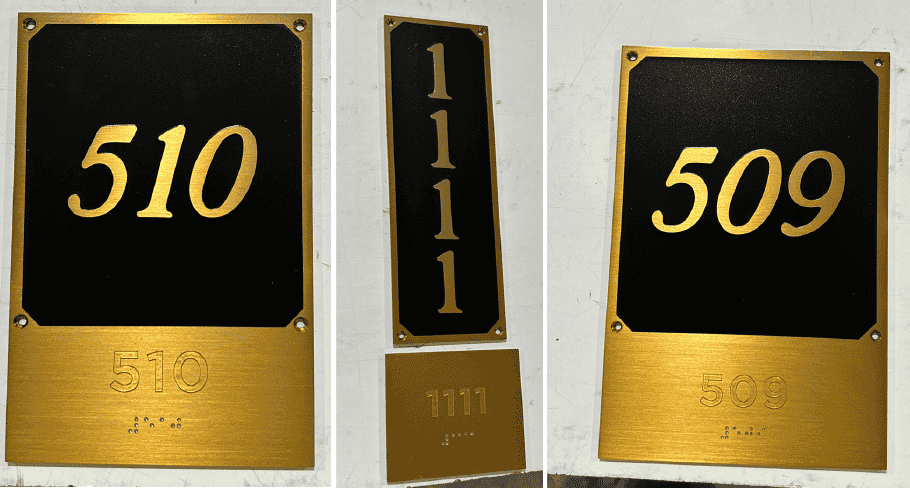
Taking a restroom setting as an example, a standard European Braille sign typically consists of three parts: Pictogram, Tactile Text, and Braille.
Pictogram
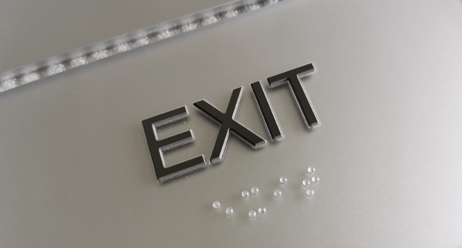
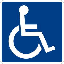
The logo should preferably adopt the international standard ISA Symbol. In the European market, the icon must not only be easy to visually recognize, but its tactile characteristics (such as the height of the raised area and the smoothness of the cross-sectional edges) must also meet accessibility requirements to ensure that visually impaired people can quickly understand the function of the area by touch.
Tactile Text
Considering the current multilingual landscape in Europe, EN 17210 provides functional guidelines for written content, rather than rigid word rules (excerpt from EN 17210, 6.6.10 Sign content):
a) Signs shall be easy to understand, designed to be simple and easy to interpret.
b) The message should be unambiguous.
c) Short sentences and simple words should be used. Abbreviations and very long words are hard to understand and should be avoided.
Braille
Although languages differ, European countries have largely reached a consensus on the physical dimensions and spacing of Braille Dots and Braille Cells, and most use the Marburg Braille standard. However, some countries use Marburg Large Braille, while others use Marburg Medium Braille. For example, Germany, Italy, and Switzerland use Marburg Large Braille, while France and Poland use Marburg Medium Braille.
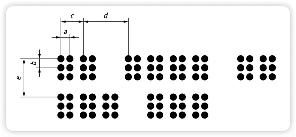
Germany Braille Dot & Cell Dimensions(Marburg Large)
| Parameters | Description | Dimension |
|---|---|---|
| / | Dot Height | 0.6 mm – 0.8 mm |
| / | Dot Base Diameter | 1.5 mm – 1.8 mm |
| / | Dot Shape | Domed |
| a, b | Dot Spacing | 2.7 ± 0.1 mm |
| c | Cell Spacing | 6.6 ± 0.1 mm |
| d | Single Space Between | 13.2 ± 0.1 mm |
| e | Line Spacing | 10.8 ± 0.1 mm |
Italy and Switzerland Braille Dot & Cell Dimensions(Marburg Large)
| Parameters | Description | Dimension |
|---|---|---|
| / | Dot Height | 0.8 mm |
| / | Dot Base Diameter | 1.6 mm |
| / | Dot Shape | Domed |
| a, b | Dot Spacing | 2.7 mm |
| c | Cell Spacing | 6.6 mm |
| d | Single Space Between | 13.2 mm |
| e | Line Spacing | 10.8 mm |
France Braille Dot & Cell Dimensions(Marburg Medium)
| Parameters | Description | Dimension |
|---|---|---|
| / | Dot Height | 0.8 mm |
| / | Dot Base Diameter | 1.4 mm |
| / | Dot Shape | Domed |
| a, b | Dot Spacing | 2.5 mm |
| c | Cell Spacing | 6.0 mm |
| d | Single Space Between | 12 mm |
| e | Line Spacing | 10 mm |
Tactile Braille Sign Visual Contrast
Regarding the lighting and visibility of signs, EN 17210 sets forth core functional requirements aimed at ensuring that signs can be easily identified (excerpt from EN 17210, 6.6.8 Visual contrast in signs):
a) The text, pictograms and symbols on a sign shall have high visual contrast to the signboard, control or button on which it is placed so that it can be clearly seen, and the signboard, control etc. shall also contrast visually from the background it is placed on. Where there is not adequate visual contrast between the signboard and the background a suitable visual contrasting border can be effective.
b) Colour alone should not be relied upon to convey a message, such as red to mean danger. The words or pictograms on the sign should be sufficient to convey the message, with the colour used only as an dditional warning. This is because many people cannot identify or distinguish between certain colours, although their sight is otherwise not impaired. To provide visual contrast on signs, use contrast in tone rather than contrast in colour. For instance, using green to contrast with red would not provide good visual contrast, because these colours look identical to some people. A very light colour, close in tone to white, against a very dark colour, close in tone to black, would provide good visual contrast.
However, in actual projects, to ensure successful passage of accessibility audits across Europe, we recommend directly referring to the more specific and quantifiable 70/30 LRV Contrast Rule in the UK’s BS 8300:
BS 8300-2 Guide: Installing Tactile & Braille (DDA) Signage in UK
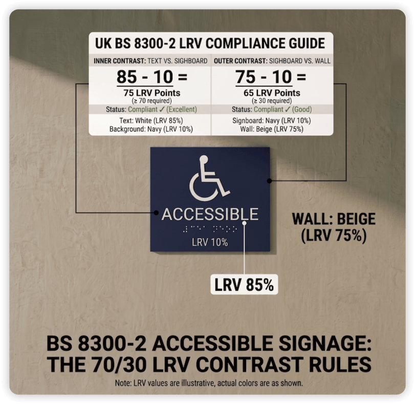
However, in practice, while LRV ≥ 70 is the gold standard for ensuring optimal readability, in customized projects, clients’ brand VI colors often struggle to achieve this ideal value. In such cases, it is still recommended that the contrast between the characters and the background should at least meet a minimum of ≥ 30 – this is a safe threshold to ensure that the characters can still be recognized by visually impaired individuals. If even this value cannot be achieved, techniques such as adding contrasting borders can be used to ensure that the signage both conforms to the brand’s aesthetics and passes the stringent European Accessibility Audit.
Tactile Braille Sign Installation
The compliance of Braille sign installation is the final hurdle in project acceptance. In Europe, due to the large number of historical buildings and their diverse styles, the EU has not established a single mandatory height standard, but rather each country formulates its own based on its specific circumstances.
The table below summarizes the core standards and recommended installation heights (vertical wall signage) of some European countries:
| Region | Country | Reference Standard | Recommended Mounting Height |
|---|---|---|---|
| Western | UK | BS 8300-2:2018 | 1400 mm ~ 1600 mm |
| Central | Germany | DIN 32986 / 32976 | 1300 mm ~ 1600 mm |
| Western | France | NF P98-351 | 1300 mm ~ 1500 mm |
| Southern | Italy | D.P.R. 503 / 1996 | 1400 mm ~ 1700 mm |
| Southern | Spain | CTE DB SUA / UNE 170002 | 1200 mm ~ 1600 mm |
| Eastern | Poland | Standardy Dostępności | 1200mm ~ 1600mm |
| Western | Ireland | Tech Guidance Doc M | 1200 mm ~ 1600 mm |
Pro-Tip for International Distributors:
The “1500 mm” Universal Solution: To minimize the risk of non-compliance in cross-border projects, we recommend a standard centerline mounting height of 1500 mm. This value falls within the legal range of nearly all European countries mentioned above.
Additionally, always ensure the sign is mounted on the Latch Side (the side where the door handle is located) to prevent users from being struck by a swinging door.
FAQ
What is Marburg Braille?
Marburg Braille refers primarily to the Marburg Medium standard for Braille, a specific set of dimensions optimized for tactile readability on pharmaceutical packaging and labels. It ensures consistency across languages, materials, and production methods, as endorsed by European and North American standards.
Marburg Braille has two standards: medium and large. The main difference lies in the cell size and spacing, as shown in the table below:
| Feature | Marburg Medium | Marburg Large |
|---|---|---|
| Dot spacing (x/y-axis) | 2.5 mm | 2.7 mm |
| Character width | 6.0 mm | 6.6 mm |
| Word spacing | 12.0 mm | 13.2 mm |
| Line spacing | 10.0 mm | 10.8 mm |
| Dot diameter | 1.3–1.6 mm | 1.5–1.8 mm |
What is LRV?
LRV stands for Light Reflectance Value, it is a color parameter.
A color’s LRV measures the amount of visible and usable light that reflects from or absorbs into a painted surface. Simply put, LRV measures the percentage of light a paint color reflects.
In the field of signage, LRV difference is an indicator of how easily a sign is identifiable. In Europe, a minimum LRV difference of 30% is generally required, while in the UK, the requirement is 70% LRV difference inside the sign and 30% LRV difference outside the sign, which is known as the 70/30 LRV Contrast Rule.
Take Away
The situation regarding Tactile Braille Signs in Europe is more complex than in other countries, mainly because the European Union has many member states with significant differences in language, historical architectural styles, and so on. Therefore, when customizing Tactile Braille Signs, it is necessary to consider the language habits and architectural styles of each country. More importantly, it is not enough to just focus on the unified European standard EN 17210; local building codes must also be carefully studied to avoid non-compliance.
In short, to install wall-mounted Tactile Braille Signs in Europe, you need to use ISA Symbols, ensure the text is easy to read and understand, unambiguous, and use simple sentences or words. For Braille size, you should use either Marburg Medium Braille or Marburg Large Braille, depending on the specific country. It should be installed on the latch side at a height of about 1500mm, which should generally meet the requirements.
As a veteran expert in this industry, FT Signage not only focuses on the products themselves but also closely monitors industry standards and developments. This is to accurately grasp the needs of our clients and provide them with tailored products and services.
Welcome to contact us to discuss your customization needs and explore further details.
References: